Tuesday, March 19, 2019

Construction


Construction

 
For my adverts, as stated in my Statement of Intent, I wanted for the advert to look like a before and after food delivery advert, displaying the emotions expressed by hungry teens before food delivery vs after food delivery. Therefore I wanted the first shot to be in black and white to symbolise that hunger is a thing of the past, and our food delivery service is bringing the audience into the future. It is also a link to how our food delivery service is targeted at the youth, who are the future generation. I wanted for the first shot to look a defined black and white, rather than a sepia look, as it is more eye catching. In the second shot, I wanted for the red and the check print shirts to look very vibrant and again, eye catching to the audience. I used a vibrancy mask to give it the bold colouring.

When I was editing my photos, I left a 1/4 inch bleed around the edge of the photo, as that is one of the conventions for a print advert, and I wanted to stick to this convention. I wanted to make clear that this was a before and after shot, therefore I displayed the shots equally in dimensions, one atop the other. Each photo is a layer, which is what allowed me to edit them separately so they have different filters. On top of these layers I put the allocated caption in colours specified by the consumers in the research survey, with the logo displayed under the brand slogan.
In this advert, again with the first advert, I wanted for there to be a black and white photo for the before shot, and a bold and vibrantly coloured shot for the after shot. I did however put an additional interesting feature in the before shot of the vibrant flames to give the advert a more abstract and eye-catching look to the audience. I wanted the flame to be the main focus of the photo, and I believe I was successful in achieving this. In the second shot I wanted the yellow to look almost fluorescent, therefore I added a vibrancy mask to the second shot to make it look as vibrant as it is.

While editing this advert, I maintained the 1/4 inch bleed on the edge. To get the two separate colourings of the images within the advert, I kept the photos as two separate layers on either side of the paper. For the before shot, there is the additional mask of the flame, which is photoshopped into the shot to make it look very abstract and eye-catching. The flame is the third mask within the photo, which is what allowed it to be vibrant, while the photo underneath it is black and white. The tagline is displayed clearly on top of the left hand photo mask in the colours chosen by the consumers in the survey, as is the colour of the slogan

For the before shot, as seen in the other adverts, I wanted to keep the black and white theme, but to give this photo and much deeper focus on the emotions on the models face. In the after shot, the colours are much more naturally vibrant, however what makes this shot stand out is the photoshopped brand logo, which is a burger box car, skidding into the shot. This makes it eye-catching, original, and is an establishing shot for the brand, as it specifically highlights the brand as the thing making this young man react this way. There is a heavy focus on the logo, and the impression the brand therefore gives off in this shot.

When editing these photos to make this advert, I wanted to keep the advert half and half in focus, with each photo having equal dimensions, within the A4 advert, and with a 1/4 inch bleed on the edge. Both photos are two separate layers on top of the background. There is a third layer which is the skid marks which have been photoshopped on top of the original shot, and the fourth layer is the logo design. The tagline was displayed in the left with the before shot, and the slogan on the left beside the logo.


Final adverts

Final adverts


Advert 1:
In this advert, I wanted it to be connotative of the before and after elements of the food delivery. This was a popular element among people in the target market following the feedback I received. To make this clear to the audience, I decided to show the before shot in a black and white to make it look old fashioned, boring and almost depressing to the audience, as the characters look sad and gloomy, and it is something we can all relate to when we feel hungry. This is also shown in the slogan "Lonely? Feeling #hangry? We've got it sorted!" This links to the photo, as we see the two teens obsessed by technology, a link to the activities of teens, and how it can make teens seem anti-social. The use of the hashtag proved to be a popular aspect of the advert, as in the audience survey results, I saw 100% of the people who completed the survey liking this element of the advert. I decided to use the green for the hashtag, as it is an intertextual link to the hulk, whom turns green when angry, and all people can relate to becoming frustrated and groggy when hungry. I decided to use electric blue for the slogan, as it was a colour that was highlighted to be popular among the target market, as seen in the consumer feedback. In the top photo, we can see the teens being anti-social by being on their phones, despite another person to their side is of the same age and gender. I specifically done this to show in the second shot the teens putting their phones down, and engaging in conversation with each other, while also feeding that hunger. We can see the second shot in bold colouring, bright and vibrant to counter the first shot, as well as to express the feeling of finally feeding the hunger. We can see the teens looking happy while engaging in conversation, and is almost a moral to teens to put the devices down, because you may find you have something in common with another person of the same age. The food links to this in how we all feel hungry, and for these two characters, it was something that sparked their conversation. I decided for the models to be wearing the typical teenage attire of a check flannel rather than a low cut dress, the stereotypical attire of an Essex teen, and to trade it for the typical attire of all teens. It makes the teens look more relatable and normal, and doesn't mock the Essex teens, as if I had decided to do so, my audience may have been offended and decided to turn against the brand. This links to my statement of intent in how I wanted to use humour, but not in a way that will insult the target audience, and I have been successful in achieving this, as i have captured the target market well in this advert. I decided to use the electric blue again in the after shot, as it does look bold and again, it was a popular colour among the target market. The logo is clearly displayed on the after shot to show the audience who delivered the food, therefore making it clear to the audience. The tag line of the brand is "We're innit to winnit in the war on hunger!" which is a direct link to the phrases of the Essex youth, as they use phrases such as "innit", "babes", "shut uppp", and other phrases. I decided to stick with the "innit" phrase as it is most commonly used among the target market. I decided to do a play on words with the tag line in how i made "innit" and "winnit" look like they are in the same format.

Overall, I used the humour, social and youth appeal as I stated I wanted, I used the typical phrases of the Essex youth as well in the tagline for every advert. I did use the blue colours as I stated I wanted to see in the Statement of Intent, but did not use any yellow or orange in this advert, as i didn't think it would fit in with the themes and colours of this advert. There is a 1/4 inch bleed on this photo as I stated that i wanted.

Advert 2:
In this advert, I decided to give it some relatable links to the average teenager, in how they are associated with not being able to cook. In the before shot, I wanted to use humour as the selling point, as stated previously, in how teens are associated with being terrible cooks. It gives this advert a good selling point, as all teenagers are able to associate to this. I decided to stick with the black and white colouring of the shoot, but to alter it to make the fire look bright and bold in order to make it eye catching. It may not look realistic, but it makes the advert look original and eye catching. The slogan for this shot is "Bad at cooking? Feeling #hangry? Can't stand the heat? Get out of the kitchen...the food's on us!" The use of the rhetoric makes the audience question themselves, and our service gives them a solution to their questions. The slogan uses humour and youth appeal, as it is a quick solution to not being able to cook, as well as feeding the hunger. I decided to use red and green in this advert, as some people stated they would like to see red colouring within the advert, and the green being used in the "#hangry" is a running theme throughout the advert, as well as an intertextual link to being hungry and angry. In the second shot, I wanted to keep the bright and vibrant colouring to reflect the feeling of having food delivered to you, without the stress and hassle of having to cook the food yourself. The shot shows a happy teenager delivering the food, dressed in the typical attire for the average teen.  I also stuck with the humour and youth appeal elements I stated I wanted in my Statement of Intent, as the pan being on fire looks funny to the audience as it is relatable. For the after shot, I also stuck to using the electric blue colouring for the tagline, as for the reasons stated previously, it was popular among the target market group, and it stands out. The logo is again present on the after shot next to the delivery girl, highlighting what brand is offering the service. For the second shot, I wanted for there to be almost an intertextual link to "Bugsy Malone" in how all of the models for this advert are teenagers, and no adults are present. This adds to the humour and youth appeal I talked about in the Statement of Intent, and I was successful in achieving this.
Overall, this advert came out exactly as I wanted and expected it to come out based on what I stated in the Statement of Intent. I used the sans serif font all throughout this advert, as well as all of my other ones, I stuck to the 1/4 inch bleed on this image, I used people from two different races within this advert, and did not insult Essex people with harsh stereotypes within this advert, and therefore I am very happy with the outcome of this advert. I also stated I wanted for the colour yellow to be present throughout my adverts, and within this advert, i wanted my model to be wearing the colour yellow to reflect my Statement of Intent, and i stuck to this, therefore i am very happy with this.
Advert 3:
In this advert, similar to the second advert, I wanted to show how the youth are typically unprepared for adulthood, and therefore wanted to humourise it, as well as make it relatable for teenagers to look at. In the before shot, the audience can see an empty fridge, and a disappointed teenager. This humourises the fact that all teenagers keep eating, but tend not to do the shopping, and again I wanted to humorise this. I stuck to the theme of a black and white colouring to reflect the disappointment of having no food in the fridge. The slogan for this advert is "Hank marving? Too busy to food shop? Feeling #hangry? Food's on us!" The phrase "Hank marving" is rhyming slang for starving and it can link to Essex teen in how they love to use funny phrases such as this. It may also be an intertextual link to cockney rhyming slang of similar phrases to this. This is a good selling point for teen as it makes the advert funny and entertaining, and therefore teens will want to invest in it. I decided again, to stick with the use of the green and blue, as they stand out against the black and white colouring. In the second after food delivery shot, we can see another happy teenager following the food being delivered, again making it look relatable, as a person within the age bracket of this brand is using the service, and makes it clear to the audience that this service is aimed at them. In this shot, I decided to keep the theme of the advert in the colour red, which is why the check flannel is in red, the typical attire for a teenager. The tagline is also in the colour red and gives a consistency to the advert, making it look very natural and engaging. The logo is again located in the after food delivery shot to highlight to the audience who delivered to food.
Overall, this came out as expected from the mockup design, and stuck to the Statement of Intent, as I used the sans serif font, there is the 1/4 inch bleed on the border, and used the common phrases of specifically the Essex teenage demographic. I maintained the use of the hashtag, but did not use much yellow or orange within the advert, as I believed it would not fit in well with this advert.

Advert 4:
For this advert, I did not stick to the mockup design for the advert, as the consumer feedback showed that some people who answered the survey believed the locations were not well reflective of the target market. Therefore I decided to change the location to be better reflective of some of the more sophisticated members whom answered the consumer research feedback. Some of these audience members appeared to be from a University or academic background, therefore i wanted to give a fair reflection of those youth members who are in further education. For this reason, I decided to use a common room with academic posters in the background to highlight the variety of groups within the youth group. It may not necessarily be a reflection of the Essex youth, however it is a reflection of the youth group as a whole.  For the first shot, the black and white theme is retained, with the model being a black male. All of my adverts are therefore reflective of Essex as it is a multicultural area, with people of all different races being reflected in the Essex county. This was an aspect of my Statement of Intent which I wanted to be reflected, and I was successful in achieving this. The before shot shows a teenage boy, up to date in the latest fashion trends, which is a very fair reflection of teenage Essex boys. It shows him looking bored and hungry. This is also reflected within the slogan "Friday night blues? Felling #hangry? Well the party don't start till we walk in!" There is an intertextual link within this quote to the song by Ke$ha named "Tik Tok" where the lyrics "the party don't start till I walk in" are used. Ke$ha is a popular singer among people in the target group, therefore this is a good selling point for the brand. The green and blue have been used again as they were popular colours, and they stand out. The second shot is in bold colouring, and is promotional of the service as you can see the logo driving into the shot. It is a very original and eye-catching shot and this will engage the audience. The tag line is in red to make the colouring of the shot stand out, and I believe I was successful in achieving this.

Overall, this advert did not stick to what I planned for the advert in the mockup design, however I believe it actually came out better than the original plan for the mockup. It did however stick to what I wanted from the Statement of Intent in how I kept the 1/4 inch bleed, maintained the sans serif font, used bold colouring, but did not use orange or yellow as I stated I wanted, but made the colours better reflective of the adverts. This advert reflects how multi-cultural and diverse Essex is, and this is what I wanted, as seen in the Statement of Intent. Not just in this advert but in all of my adverts, I did not want to mock Essex youth or to insult them, therefore I used general humour of the youth as a selling point. Therefore I did not stick to my Statement of Intent in how I planned to use the stereotypes of the Essex youth, such as in fake tan, fake hair, fake makeup, etc, however I used other humour elements to replace this, and made it just as humourous. I did use social appeal, especially in the first advert in showing how it can help with engaging conversation among teens, and youth appeal in how I made it reflective and relatable to all teens, not just Essex teens. In conclusion, i think I stuck to the Statement of Intent with minor changes that made the adverts better.

Wednesday, March 6, 2019

Audience research and feedback

Audience research and feedback

Audience segmentation model-
Gender - for the women, I will make some of them look very orange, covered in makeup, very glam, over time top, fake nails, however, I will not take this to the extreme as I want to use humour and I do not want to offend. For the men, I will make them look well groomed, well presented, smartly dressed.

Ethnicity- Essex is well known for having a diverse community, therefore I will try as hard as possible to reflect this in my adverts.

Age - the specific age group this is targeted at is 16-25, therefore I will aim to get groups of people from the highest end and lowest end of this age bracket. I will use this to show Secondary school age youths, as well as University age people. I will use humour, as well as slang terms in order to interest this group, as I aim to create an appeal through common social terms used among this group.

Region - the region this advert will be targeted at is the Essex region. I will use this in my advert by using typical Essex terms within the advert to help the social and humour appeal.

Socio-economic - The classes this service are targeted at are the middle class, but mostly the working class. These are the classes that usually use these services, with upper classes going to restaurants instead. Therefore, I will aim the advert at this group in society, throught the use of language, mise-en-scene, and location.

4 c's segmentation model

Cross-Cultural Consumer Characterisation model
4 main categories are (MARS)
MAINSTREAMERS, ASPIRERS, REFORMERS, SUCCEEDERS
The other categories to be added to this are (ERS) EXPLORER RESIGNED  STRUGGLER


It takes the following as consumer motivations: SECURITY, CONTROL, STATUS, INDIVIDUALITY, FREEDOM, SURVIVAL and ESCAPE

The age segment of the audience model is what I will focus on, as it is what I will focus the advert on. I will link this to the 4C's model in how the youth group is associated with the 'strugglers' in how they are unable to cook. This is an element that is key in my advert, as the youth group is associated with partying. The older generation is associated less with night partying, and more dinner parties. Therefore this is an element of change in the youth's lives that i want to humorise, and highlight that the youth are still children, and therefore cannot cook, so rely heavily on takeout food.

----------------------------------------------------------------------------------------------------------------

My survey address
https://www.surveymonkey.co.uk/r/5J8RVB9

A total of 16 people answered my survey, 11 of which were female, with 5 being male. 13 of those who completed the survey were in the age range of 16-20, with one being 24, the other being 30, and the last being 51 years of age.


Q1:
Out of all of the fonts shown above, the second font proved to be most popular, with 50% (8 people) choosing the font. I will use this font in the logo, as the survey shows this this was the most popular and eye catching font that would attract them to the logo. This highlights my initial belief that the youth groups would be attracted to a funky yet formal font, as well as reinforcing the belief that the use of blue would be popular, as it is associated with nightlife and partying, which is associated with youth group.


Q2:
In this question, I asked the people answering the survey which logo was preferred, and 62.5% (10 people) voted for the burger box. This is the logo I will therefore use for my advert, as it proves itself to be overwhelmingly more popular than the car logo. in the comment box provided in this question, the audience said they liked how it "advertises the food", is "eye catching", and appreciate the "different colours". This again reinforces the idea that the youth group prefer to see bright and bold colouring in their adverts, and want to see something eye catching. The 6 people who preferred the car logo were from the older end of the age bracket, as well as being female. The 24 year old and 18 year olds preferred the car logo to the burger box, which is an area of consideration, as i want to engage the older end of the bracket, as well as the younger, therefore i will try to use more sophisticate techniques to engage the older audience.


Q3:
In this question I asked people if they liked the displayed layout of the prototype adverts. In the results, I saw 81.25 (13 people) believing that the layout of the advert was good. However, in the comment box, the audience gave good reason for not liking the layout, in how they saw the adverts as being "too close" together, as well as looking very "cramped". This is very constructive feedback, and this is a huge part of what I will be looking at and considering when editing my advert.


Q4:
The most successful aspect of my prototype advert was the use of #hangry, which received a 100% approval rate, therefore this proves the use of a hashtag is appealing to people of all ages in the bracket, as well as those outside of the bracket also. This is an element of the advert that will remain a part of the advert.


Q5:
For my next question, i asked the audience whether they associated the locations of the adverts with the target market group. This was one of the most important aspects of the survey, and almost had a full success rate, however, 93.75% (15 people) believed that the locations were well suited to the target market. The one person who did not believe so was a 18 year old female, so again, one of the older people in the survey group. This means again, i need to find locations more suited to the people at University level, therefore could use locations associated with where those in University may be found.


Q6:
In this question, i wanted to know whether the "BEFORE" and "AFTER" aspects of the advert proved popular or not. gain, we saw 93.75 (15 people) liking this aspect, with one person disliking it. Therefore this is an are for consideration of editing to change to suit a more serious audience. This also links to my intention of catering to serious members of the youth group by not playing up to the stereotypes of the Essex youth by making them look stupid or fake. I want to use humour, however, I want to engage all audience members. Therefore, i will try to cater to all people in the audience.


Q7:
In this question, i wanted to allow the audience to give their comments on what colours they would associate with the target market group, as the wrong colouring in an advert can cause it to fail, therefore the aim is to engage them in all aspects, and colour is one of these aspects. The feedback proved incredibly useful, with 13 people all saying "red, yellow and orange". These are key colours I will therefore incorporate into the advert, in terms of text colour, as well as costumes. The other three people believed that "blues" and "breezy colours" would be suitable, as those colours are "associated to royalty, and I like to feel royal". This is a key bit of feedback, as you want to make the customer feel like the most important person, therefore blue will also be incorporated into the advert. One person also suggested the use of green. This colour could be pivotal to the use of the #hangry, as one of the associations with this phrase is the Hulk who turns green when angry, therefore the use of green would be an intertextual link to the hulk who changes colour when angry. It will therefore make people think when #hangry of our service, and ultimately engage them. 


Q8:
In this question, I wanted to know whether the aspects of advertising that i chose were popular among the target market. The feedback showed a 100% positive response rate, with all audience members believing the humour and social appeal were visible in the advert. This is an aspect i will therefore maintain, as it had a positive response among the audience members.


Q9:
In this question, I allowed the audience to write whether the adverts stood out or not, and to give reasons for their answer. The answers showed that 14 members of the audience believed yes, and two said no, however gave no reason for their answer, and therefore gave no constructive feedback for improvement. The responses from the 14 people who believed it stood out stated that it was "pretty clear and straight forward" which was what I wanted to achieve, as I do not want it to be too complicated that the audience get confused about what is being sold. Another person said they like the "bright colours" which made it look "interesting". Repeatedly people stated they liked that it was "really simple" and "not too complicated" as it "shows what the food service does" which is what I wanted from my advert. People commented on how "unique" the adverts were, "original" and "eye catching", as they have "not seen it before" in a food advert, which is a huge positive. The final area of the advert spoken about was how "it showed the daily life" of a person in the target audience, which they enjoyed seeing, as it is not abstract, it is realistic, and therefore appeals in a factual way to the audience.


Q10:
For the final question, I wanted people to state the age and gender of the audience members to see who identifies with which aspects of the advert, as well as what age bracket they are in. It has allowed me to see which female members like what aspects, and which male members have liked or disliked other aspects. An example of where this proved effective was in Q2 where 6 people preferred the car design, all 6 except one were female, therefore this is a huge area of consideration of altering, as it is the female audience members who preferred that design.


Friday, March 1, 2019

Casting, props and costumes

Casting, props and costumes

Casting-
I want my cast to be as diverse as possible, with there being a variety of different ethnicities. I have two female friends, one being Indian, and one being Mauritian. I will also use a fellow classmate who is male and part of the BME group, as this also is an important group to represent. I will also be a model in my adverts, bringing the white representation also into the advert. I specifically want to showcase all ethnicities, as Essex is an area with a lot of diversity, which it is well known for. I wanted to give a fair and truthful reflection of Essex's diverse cultures.
Model 1:
Age: 19
Reason chosen: Mixed heritage teenager, fitting in with the target market of the service, as well as representing the diverse ethnicities within Essex. Using her as a model for this advert gives a factual and fair representation of Essex.

Model 2:
Age:18
Reason chosen: mixed heritage teenager, looks like the typical trendy teenager. Because of her style, she fits in with the average teenage crowd. This also adds to the representation of Essex as a diverse area in England.

Props-
The predominant props I will use on my adverts will be food, takeaway boxes and bags. If there is too much going on in the adverts, it gets too cluttered and people lose interest. Therefore I want people to look mainly at the food bags and boxes, as that is what I am selling to the viewer. The average teenager only has a short attention span, therefore I want to gain it a quickly as possible and for as long as possible, with a eye catching, original, yet basic advert.


Costumes-
In my advert, I plan on using humour, but not so that it mocks Essex as a region. Therefore all my models will be dressed respectfully, and they will be dressed in the colours associated with Essex, as well as the target market groups. From the responses I received in the consumer research, I saw that people wanted to see the use of blues, reds, yellows, oranges, etc. Therefore I will incorporate these colours into the costumes for the adverts. I want to have my models dressed respectfully as I do want to break from some of the stereotypes of Essex people, especially the youth. 

Location scouting

Location scouting

This location is the first location I will use in my adverts. I will have two of my models looking lonely, sitting on their own and bored, consumed only by their phones. In the second shot in the advert, we see the two youths putting their phones down and bonding over food. This shows that no matter our differences, all people have to eat, and the advert shows how if we put our phones away and look at what is going on around us, we can all see something in common with the next person. I specifically chose this location as the youth is notorious for going out and drinking in local parks, therefore this is a link to those activities. It may also bring out memories of going out drinking in a local field after finishing exams, which is a common activity, especially among Essex youth.


I will use this location as an after shoot for when the food is being delivered. It will show a colourful youth who looks like a typical teenager delivering the food. It almost puts a 'bugsy malone' theme to it, as we see the youth taking on all roles within this advert. This location was chosen specifically as all food delivery services have to bring the food directly to you, therefore it will most commonly be delivered to the home. It highlights that our service delivers to the traditional location, as well as new locations, as seen in the local park in the previous photo.


In this location, I will show a person who has just ordered food, looking very happy. I chose this location as people no longer sit at dinner tables to eat dinner, and it shows the informality of the youth groups, as well as the changes in society and traditions. It shows that people eat in all sorts of casual locations, as long as it is somewhere they are comfortable, they will eat there. It links to the youth as most teens are commonly found lounging around in the living room watching TV, therefore it is a relevant location for the average teenager.


I will use this location for two images to be used in my adverts. In the first advert, I will show a typical teenager being unable to cook food, and the pan is therefore on fire. It plays on the humour of the youth being notoriously unable to cook. In the second advert, we see the fridge being used to show how the youth doesn't spend money on valuable things, and how they don't keep their fridges fully stocked. In this shot we will see the fridge being empty, with a youth looking very sad. This will be the before food delivery shot. It is a relevant location as all people have to eat, and another common activity for the average teenager is to keep eating food, which is why our food delivery service is targeting these specific locations, as well as the youth group in order to highlight the fact that we are the most relatable food delivery service for them, as we can understand the average teenagers habits, and highlight these habits in our adverts.

Wednesday, February 27, 2019

Statement of intent


Mock up designs

For this advert, I want to make the left half look dark and dull, in order to show that it is a before shot. There is an importance of it being dark and looking dull, because I want people to relate to the feeling of being hungry and having no food. In the right half, we will see a person looking much happier, with the photo edited to look much brighter, in order to reflect the happy and satisfied feeling of finally having something to eat that you haven't had to cook. I want the before shot to have the text of 'Hank marving? Too busy to shop? Feeling #hangry? Food's on us!' I chose this because there are certain elements of the quote that have a link to Essex phrases, as well as the # which is a common theme among the youth group, as well as Essex people. This will be a running theme throughout all of the adverts, as a # is something to associate a brand with, and that is what I want for my food delivery advert. I will also have this text in a bold colouring, either a blue, or red colouring, with the #hangry being in a green colour, as this is an intertextual link to the hulk who turns green when he gets angry, and all people can relate to getting grouchy when they get hungry. On the right side, there will be the tagline of 'We're innit to winnit in the war on hunger!' The use of the phrase 'innit' is important, as it is another link to the commonly used Essex phrase. This gives it the personal touch of Essex culture. This will also be in a bold colour, either a red, gree, or blue. The logo will also be displayed on after delivery side of the advert to make people aware of the service that delivered the food.For this advert, similar to the first advert, the first shot will be the before food delivery shot, showing people sat all separate, looking bored, lonely and hungry, with the photo edited to look dark and dull, all models will be acting very antisocial by being on their digital devices, which is a link to the youth group as a whole in how they are obsessed by technology. In the second shot after the food is delivered, we will see the models looking happy, content, and being social with the other people they are surrounded by, with the photo being edited to look bright and vibrant. The story in this advert is that people may be different in personality and appearance, however we all have one thing in common, and that is that we have to eat and that we all get hungry. Sometimes we need to put our phones down to see the wider picture which is what the narrative is in this advert. The text in this advert will say 'Lonely? Feeling #hangry? We've got it sorted!' This highlights that we all share food in common, and therefore eating food with another person can make you feel a little less lonely. The tagline will be displayed in the after food delivery shot alongside the logo.


For this advert, there will be the before and after food delivery shots. In the first shot we will see a person holding a pan that is on fire, clearly trying to cook but are not good at it. This will link to the slogan 'Bad at cooking? Feeling #hangry? Can't stand the heat? Get out of the kitchen...food's on us!' This is therefore using humour and relatability to sell the brand to the audience. The image will again, be edited to look dark and dull. In the second shot, we will see a person delivering the food, looking happy and cheerful, with the photo edited to look vibrant. There will also be the tagline and the logo displayed on the right side of the advert, to highlight that the person delivering the food comes from this food delivery service.

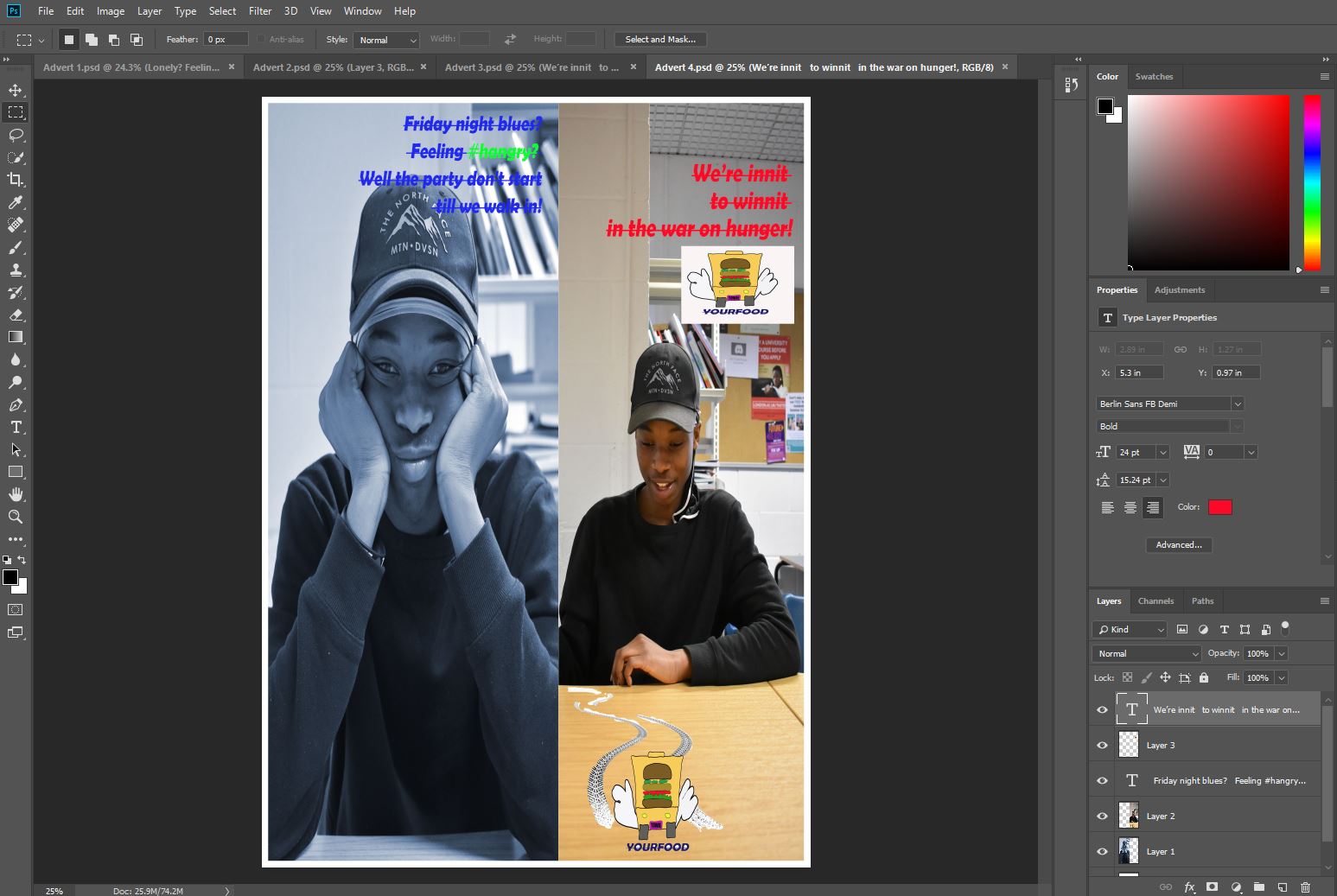
With this advert, I am playing around with the location, as well as what I want the models to be doing. The theme of the advert will be being social. It will show people looking disappointed and bored. This is an evident side effect of being hungry. In the second shot, we will see people looking much happier after they have eaten their food. The slogan on the before shot will say 'Friday night blues? Feeling #hangry? Well the party don't start till we walk in!'. Again, with this advert, I will be highlighting the party atmosphere among most specifically the Essex youth group, as seen in The Only Way Is Essex. 'The party don't start till I walk in is also a link to the singer Ke$ha who the lyrics belong to, and whom is also popular among the youth group. This is therefore another intertextual link to a celebrity whom is popular with the youth. The tagline and logo will again be present on the after food delivery side of the advert.


Wednesday, February 13, 2019

Advertising research

Advertising research

Strategies for advertising products

  • Endorsement
  • Individual incentive - BOGOF
  • Bold headings - catchy/memorable
  • Alliteration - "Bob's Big Breakfast"
  • Font - Serif and Sans Serif (modern)
  • Celebrity endorsement - Gemma Collins
  • Intertextual links - THE ONLY WAY IS ESSEX
  • Bright and bold colours
  • Student discounts
  • Social media
  • Hashtags
  • Images
  • Humour
  • Exaggerated stereotypes
  • Quotes or phrases - Vernacular (everyday language) e.g. "Peng", "reem", "innit", "y'know what i mean"
  • Logo
  • Saturated colours
Methods for advertising appeal that i am inspired by:


Humour
Beauty
Youth
Endorsement
Popularity
Potential
Social
Pain solution


All elements I will use when making my advert:
Font :Berlin Sans FB Demi with a line going within the text, as i want to make it look modern and almost futuristic, and the targeted audience is 16-25 year olds. This is the font that will be used in the logo, and will be used for the slogan.
See the source image
The sans serif font i will use for the coverline is Haettenschweiler font, as it is formal and will be in the blue colouring. I will use this font as it is formal but also futuristic, as well as the colouring being blue as it is almost disco colouring and party colouring.


One half dull colouring = before the food   One half bright and vibrant =after the food

Slogan "We're innit to winnit in the war on hunger!"


 Rhetoric questions

Want it to be set out life a before the food delivery vs  after the food delivery
See the source image

Use of hashtag = #hangry
See the source imageSee the source image I want to base it on before our food is delivered and the emotional issues around not being able to cook, or having no food etc, vs having food.


------------------------------------------------------------------------------------------------------------------------


Concept 1:
University student with no food in his fridge and starving so orders food and is happy
Use rhetoric questions such as "Hank marving? Too busy to food shop? Feeling #hangry? Food's on us!"


Half 1:                                                       Half 2:
Dull colouring, boring, uninteresting       Bright, bold, exciting and relateable to when you have food food                                     
See the source image                               See the source image


Concept 2:
Lonely student sitting on the grass while people are sitting chatting behind him. He wants to join in and they all have one thing in common...they are all hungry. He orders the food and becomes popular.
Use rhetoric questions such as "Lonely? Feeling #hangry? We've got it sorted!"


Half 1:                                                           Half 2:
 Dull, sad and cold feeling                             warm, bright, vibrant and friendly, happy                        
See the source image                     See the source image


Concept 3:
Group party with 18+ people. Party is very boring, people falling asleep, etc. The food gets delivered and it is very lively!
Use rhetoric questions such as "Friday night blues? Feeling #hangry? Well the party don't start till we walk in!"

Half 1:                                                             Half 2:
Dull, dark lighting, harsh almost                 Bright lighting, fun atmosphere, vibrancy, happy people


See the source image                 See the source image

Concept 4:
Young people trying to cook, the pan is on fire and the kitchen is chaos. They opt for getting food delivered instead.
Use rhetoric question such as "Bad at cooking? Feeling #hangry? Can't stand the heat? Get out of the Kitchen....the food's on us!"


Half 1:                                                             Half 2:
Bright flames, almost like the                         Happy person getting their food delivered
flames of hell. Doom and gloom.


See the source image                      See the source image


----------------------------------------------------------------------------------------------------------------
Location for Concept 1:
Kitchen/fridge
Location for Concept 2:
Local park


Location for Concept 3:
Living room


Location for Concept 4:
Kitchen and front door
Props for Concept 1:
Fridge
Pizza box
Burger box


Props for Concept 2:
Study books
Backpacks
Pizza boxes
Burger box


Props for Concept 3:
Beer bottles
Wine bottles
Pizza
Pizza boxes
Burger boxes
Burgers
Props for Concept 4:
Frying pan
Burger boxes
Pizza boxes


Wednesday, February 6, 2019

Textual analysis of print adverts

Textual analysis of print adverts


In this advert, I like how the advert uses vibrant colouring to make it interesting and intriguing to look at. I like how there is a contiuing them throughout all of the adverts, and this is an aspect that i will use in my advert, as the layout is interesting, and I want my advert to be as intriguing and interesting as this one. Especially because my food dellivery service will be targeted at the youth group, I want to use the bright colouring to intrigue them, and use the uniqueness of the advert as a selling point.


In this advert, i like the sophistication of the advert, and how it makes the food look appetising to the buyer. I won't be trying to sell the food like a gormet food delivery service, just as a quirky food delivery service that will appeal to the target age group.


I prefer the second logo in how the colours are more muted and natural. The green colouring would be good to associate with the healthy types of food, however I will be targeting the youth group, therefore have little interest in healthy food for a food delivery service. In my advert, i think i wil use the elelemnts of the defining ofd the elements in the lgoo so that it appears very bold and so that it is clear to the audience what they are looking at.


In these logos, my interest is in the colours used in the second advert. I want to use bright vibrant colours in my logo to make it stand out as much as possible. The current youth group has an interest in the colours of the rainbow, not only as part of the pride movement, but also because of a new movement of favouratism of wearing unique and funky clothing. If i could some of these colours in my logo, it would be a good selling point for the brand, therefore i will incorporate this into my logo.


Logo design

My research on logos


See the source image In this logo the use of bright and vibrant colouring is interesting to the audience to look at, as the variety of colours may be representative of the variety of things you can see in the different programmes that Sky broadcast on its channel. The bright, bold, saturated colours are analogous, meaning next to each other on the colour wheel. The colours look exotic and adventurous, and this draws the audience in. the use of the sans serif font is used in order to keep the brand sophisticated and formal. The glow on the writing looks almost like the glow you would see on a device screen, therefore the logo may be trying to channel the changing society within its logo.

Elements I will take from this logo are the bright colouring, such as the red and the blue, as they are vibrant colours, red often being associated with food, and blue being associated with nightlife, which is a huge part of Essex youth culture, therefore i want to add this association to my advert. 

See the source imageIn this logo, we see the use of the bright blue and white colouring. This brand is associated with children as they make films that are associated with childhood characters. The use of white is therefore significant in how children are associated with innocence, and white is a colour that symbolises innocence. The blue is symbolic of a calming and relaxing environment. For a child, these colours are associated with dreams and fantasy. The use of the serif font makes it look intriguing, interesting and fancy, and to a child this is interesting as it looks almost friendly and soft. This writing has sicne become a recognisable symbol that is universally known in how it is different from other fonts. The use of the castle symbol in the background has been done to again, attract a younger audience, as the castle is associated with a fairy tale, as well as an adventure story.

In this logo, I cannot see any elements I  would like to replicate, as I would prefer to use a more sophisticated sans serif font, as it is common practice for logo text. I do however like how there is an object with the brand name, therefore this is an element I will incorporate into my logo, as if the brand name is not memorable on its own, the logo may be a recognisable symbol.


See the source imageIn this logo for HMV (His Master's Voice) we can see a sans serif font used which looks almost like a neon sign light, which creates a link in a viewers mind to electricity, and then technology, which is what HMV is all about, selling technological devices, CD's, DVD's and many other things. The symbol of the dog listening to the gramophone is a direct link to the full name of the company, His Master's Voice, as at the time the shop was created, there was a coined phrase of which the company shares it's name, as well as a painting of  dog listening to a gramophone. The decision to use this as the logo was a cultural and contextual link to the time the company was created. The colours used are not complimentary, nor analogous, however they are an interesting combination, as they are not dull, they are very bright and saturated. Again, the colours used create almost a glow of the neon signs that you may have seen in the 1980s, another contextual link to the upgrading of the symbol.

In this logo, i like the use of a bold, sans serif font, which is something I will incorporate into my logo, as i like the formality, as well as the simplicity of it, which makes it a  recognisable logo. Therefore i will try to add these elements into my logo to make it a recognisable but simple as possible.
See the source image With this logo, we can see a little boy fishing while sitting in the moon. Straight away, the two colours of white and blue are associated with sleeping and dreaming, and this is a direct link to the name of the company, Dream Works, as they want to play on specifically children's imaginations, and make them see things that are not normal, such as fishing on the moon which is seen in the logo. When the logo was created, Spielberg wanted it to reflect the golden years of Hollywood, so decided to use the moon as one aspect of the logo. The child is a contextual and social link to the creator, as it is the creator's son used within the logo. The font used is a serif font, which is often used in products that will be seen by children, as it is more fun, interesting, and less serious than a sans serif font.

In this logo, again, i like the use of the memorable logo with the recognisable brand name text, as seen in the previous two logos. again, the icon and the text is a strong element that i will draw inspiration form in designing my logo. I like the continuation of the logo being all one colour, however this is not an element I will use in my logo, as i want it to stand out and be bold, and to be bold in my advert, I would like to host a variety of different colours.

Image result for odeon logoThe Odeon cinema logo is very basic in it's format, in how it is only text, yet there are many contextual links. The font used was chosen in order to replicated the Hollywood sign, which the company has a direct link to. The shaping of the font has also been used to make the text look like an old cinema ticket in how it had cut edges. The colours now used are mainly blue, which is a very calming colour, as well as being associated with dreaming, and being in a world that may not necessarily exist. The use of font and colouring is very basic, but an exact refection of what the company is and what it stands for.

With this logo, i love the simplicity of the logo, and how it has a contextual background to it in what the name is associated to, accordingly with my logo, i will attempt to give my brand name a link to the audience i am aiming my service at. Such as the use of a font similar to the blade runner font, as it is a futuristic film, and the youth is the future generation of the world, therefore there is an intertextual link to the future. I would also like to try and incorporate stereotypes of Essex youth within the logo, such as with the use of orange (orange skin), or blue (nightlife). 

Task 1 -Demo


In my first attempt at designing my logo text, I decided to try and test out the different types of sans serif fonts. I knew immediately that i wanted my logo to be done in a sans serif front as i wanted the font of the brand name to be formal, and futuristic looking. The serif font is usually used to make a text look old fashioned, such as gothic, or funky, and this was not the style i was going for. I wanted to go with a fun, futuristic, almost disco looking text that would make people double look at what they are seeing. I experimented with putting lines through the text, which i intent to try and make look like the blade runner font, as that is a film set in the future, and the text gives off a futuristic look. I will need to learn how to make the line through the text invisible so it will look like there is detachments in the characters. With the second font above, i was aiming to try and make it look almost like the characters are dancing, however the font came out too funky for the look i was going for, so i will not use this font in the future. For the third design, i was experimenting with changing the layout of the font by making it look like it had been twisted forward on an axis. However, this is not a design that i believe is futurstic enough, and does not stand out as being futuristic looking as it looks like a generic funky font. For the last design, i wanted to see what a standard bold font would look like with a outline. This experimenting gave me an idea of how i may want my other designs to look, such as with one colour fill, and another colour outline. This is something i want ot incorporate into my next designs.


The fonts used are as follows:
1. Berlin Sans FB Demi
2. Lithos Pro
3. Myriad Pro
4. Impact

Task 1 - Logo design


From the demo that i done previously, i picked out the bits that i liked most out of all of the practices i done, and put all of those elements into these designs.

The fonts used are as follows:
1. Haettenschweiler
2. Berlin Sans FB Demi
3. Eras Bold ITC

With the top font I wanted the text to be big, bold and stand out. This is why I changed the width of the font, made the writing bold, and gave an outline to the text. I wanted there to be a running theme of being bold and standing out. I done this as almost a metaphor for the youth group being a bold generation, set out on a quest to stand out from other previous generations. I used the blue colouring as I wanted there to still be the association to nightlife and partying, and blue is a colour commonly seen in nightclubs as it gives almost a neon glow.

With the middle font, I wanted to keep the elememets from my font test of the line going throught the test, as I wanted to keep the inspiration from the blade runner font, as again, it is is futuristic and exciting. I also wanted to experiment with the inside of the font by adding  a pattern into the middle of it, in order to make the logo more unique and interesting. I kept the same colourings of black and blue as I wanted to keep the nightlight association.

With the final font, again, I wanted to experiment with my use of patterns and see what would stand out the most. With this font, I decided to get rid of the outline of the font and see how to make it stand out without having to keep a bold outline, as well as being adventurious with the colourings.

After my testing of all the fonts, colourings and patterns, I have decided I will stick to the deisgn I created in the middle example, as I conducted a small survey on five people in the specified age group, all of which said they preferred the middle font.

Logo design 1

For my first design, I wanted to incorporate the Essex stereotype of the obsession over appearance and looking good, therefore decided to have the characters in a flashy, expensive car. I also decided I wanted a fair representation of all people, so have men women, and people from all groups in society. One of the characters was made to look like the stereotypical Essex girl with the blonde hair, fake tan, heavy makeup, big hair, fake lashes, big boobs, as well as glam. This was made to have a intertextual link to The Only Way Is Essex, and specifically, Gemma Collins, a prominent Essex woman. The next character is a spotty, technology obsessed burger, representing the teenage group stereotype, as well as a sporty pizza. The font has been placed on the side of the car as it makes the whole design come together as one, and makes it look almost cosy. The use of cartoons and over emphasising stereotypes has been done as a humour element to grab the audiences attention, as humour is a technique to gain attention. The fact that it is food shows that it Is a food service, as well as it driving a car, combined to create the idea of food driving to you. therefore there is a narrative behind the logo, which is the food being delivered to you.
When creating the logo on photoshop, every layer was a single item on the logo, such as one tyre, then the other tyre. I done this as I wanted to make sure each specific element was perfect, and the other elements I wanted to improve on from the drawing, were covered over and drawn on after all layers were filled and outlined. I decided to make the colouring as bold and bright as possible, such as the pink car, as this is a colour typically associated with Essex girls wearing, which is why the Gemma Collins chip is also wearing pink. I wanted to create a party atmosphere, which is why the font used is futuristic and like something you would see plastered in a bar or nightclub.


This was the final outcome of design number 1. I was happy with the sharpness of the shapes, such as the outline of the car, the characters, and the colours used definitely stand out to the audience. When I asked 5 people in the age group the brand is targeted at, they said they liked the colouring, and also said they liked the humour element in how it pokes fun at the stereotypes associated with Essex people.


Logo design 2


For my second design, I immediately knew I wanted the intertextual link to The Only Way Is Essex, and so I decided to use this as the number plate. Again, I played on the stereotype of Essex people being obsessed with appearance and cars, therefore a car burger box feeds the stereotype, as well as bringing an element of humour into the product. The idea of a burger driving brings further humour to the logo, as it seems so silly, but it makes you laugh. There is also the intertextual link to Essex youths driving dangerously, so puts a comedic spin on a negative stereotype of Essex youths being involved in crime. Again, we see the logo close together in format, in how the text is under the wheels, almost like it is driving over it. Again, we see the same narrative as in the first logo, with the burger driving itself to you, highlighting that it is a food delivery service. 

The same as with the first logo, I decided to make each individual bit of the drawing a layer which I masked by colouring the inside and creating stroke outlines of different depths to emphasise certain bits of the drawing. With the number plate, I wanted to keep the pink intertextual link to girls from Essex in how they are associated with being obsessed with the colour pink.

The final logo came out exactly how I wanted it to. From the 5 people in the age group the product I targeted at, all 5 said they love the creativity of the logo, with all of them pointing out the TOWIE number plate as a point which drew their attention, as well as the vibrant use of colours. I wanted to include elements of both the males and females of the target market, and used elements form these groups in the form of a speeding car, for the boy racers, as well as reckless drivers, and the pink personalised and branded number plate for the ladies, as it is a personal touch of glamour, as well as being an intertextual link to TOWIE.