My research on logos
 In this logo the use of bright and vibrant colouring is interesting to the audience to look at, as the variety of colours may be representative of the variety of things you can see in the different programmes that Sky broadcast on its channel. The bright, bold, saturated colours are analogous, meaning next to each other on the colour wheel. The colours look exotic and adventurous, and this draws the audience in. the use of the sans serif font is used in order to keep the brand sophisticated and formal. The glow on the writing looks almost like the glow you would see on a device screen, therefore the logo may be trying to channel the changing society within its logo.
Elements I will take from this logo are the bright colouring, such as the red and the blue, as they are vibrant colours, red often being associated with food, and blue being associated with nightlife, which is a huge part of Essex youth culture, therefore i want to add this association to my advert.
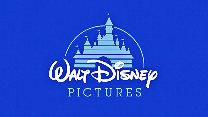 In this logo, we see the use of the bright blue and white colouring. This brand is associated with children as they make films that are associated with childhood characters. The use of white is therefore significant in how children are associated with innocence, and white is a colour that symbolises innocence. The blue is symbolic of a calming and relaxing environment. For a child, these colours are associated with dreams and fantasy. The use of the serif font makes it look intriguing, interesting and fancy, and to a child this is interesting as it looks almost friendly and soft. This writing has sicne become a recognisable symbol that is universally known in how it is different from other fonts. The use of the castle symbol in the background has been done to again, attract a younger audience, as the castle is associated with a fairy tale, as well as an adventure story.
In this logo, I cannot see any elements I would like to replicate, as I would prefer to use a more sophisticated sans serif font, as it is common practice for logo text. I do however like how there is an object with the brand name, therefore this is an element I will incorporate into my logo, as if the brand name is not memorable on its own, the logo may be a recognisable symbol.
 In this logo for HMV (His Master's Voice) we can see a sans serif font used which looks almost like a neon sign light, which creates a link in a viewers mind to electricity, and then technology, which is what HMV is all about, selling technological devices, CD's, DVD's and many other things. The symbol of the dog listening to the gramophone is a direct link to the full name of the company, His Master's Voice, as at the time the shop was created, there was a coined phrase of which the company shares it's name, as well as a painting of dog listening to a gramophone. The decision to use this as the logo was a cultural and contextual link to the time the company was created. The colours used are not complimentary, nor analogous, however they are an interesting combination, as they are not dull, they are very bright and saturated. Again, the colours used create almost a glow of the neon signs that you may have seen in the 1980s, another contextual link to the upgrading of the symbol.
In this logo, i like the use of a bold, sans serif font, which is something I will incorporate into my logo, as i like the formality, as well as the simplicity of it, which makes it a recognisable logo. Therefore i will try to add these elements into my logo to make it a recognisable but simple as possible.
 With this logo, we can see a little boy fishing while sitting in the moon. Straight away, the two colours of white and blue are associated with sleeping and dreaming, and this is a direct link to the name of the company, Dream Works, as they want to play on specifically children's imaginations, and make them see things that are not normal, such as fishing on the moon which is seen in the logo. When the logo was created, Spielberg wanted it to reflect the golden years of Hollywood, so decided to use the moon as one aspect of the logo. The child is a contextual and social link to the creator, as it is the creator's son used within the logo. The font used is a serif font, which is often used in products that will be seen by children, as it is more fun, interesting, and less serious than a sans serif font.
In this logo, again, i like the use of the memorable logo with the recognisable brand name text, as seen in the previous two logos. again, the icon and the text is a strong element that i will draw inspiration form in designing my logo. I like the continuation of the logo being all one colour, however this is not an element I will use in my logo, as i want it to stand out and be bold, and to be bold in my advert, I would like to host a variety of different colours.
 The Odeon cinema logo is very basic in it's format, in how it is only text, yet there are many contextual links. The font used was chosen in order to replicated the Hollywood sign, which the company has a direct link to. The shaping of the font has also been used to make the text look like an old cinema ticket in how it had cut edges. The colours now used are mainly blue, which is a very calming colour, as well as being associated with dreaming, and being in a world that may not necessarily exist. The use of font and colouring is very basic, but an exact refection of what the company is and what it stands for.
With this logo, i love the simplicity of the logo, and how it has a contextual background to it in what the name is associated to, accordingly with my logo, i will attempt to give my brand name a link to the audience i am aiming my service at. Such as the use of a font similar to the blade runner font, as it is a futuristic film, and the youth is the future generation of the world, therefore there is an intertextual link to the future. I would also like to try and incorporate stereotypes of Essex youth within the logo, such as with the use of orange (orange skin), or blue (nightlife).
In this logo the use of bright and vibrant colouring is interesting to the audience to look at, as the variety of colours may be representative of the variety of things you can see in the different programmes that Sky broadcast on its channel. The bright, bold, saturated colours are analogous, meaning next to each other on the colour wheel. The colours look exotic and adventurous, and this draws the audience in. the use of the sans serif font is used in order to keep the brand sophisticated and formal. The glow on the writing looks almost like the glow you would see on a device screen, therefore the logo may be trying to channel the changing society within its logo.Elements I will take from this logo are the bright colouring, such as the red and the blue, as they are vibrant colours, red often being associated with food, and blue being associated with nightlife, which is a huge part of Essex youth culture, therefore i want to add this association to my advert.
In this logo, I cannot see any elements I would like to replicate, as I would prefer to use a more sophisticated sans serif font, as it is common practice for logo text. I do however like how there is an object with the brand name, therefore this is an element I will incorporate into my logo, as if the brand name is not memorable on its own, the logo may be a recognisable symbol.
In this logo, i like the use of a bold, sans serif font, which is something I will incorporate into my logo, as i like the formality, as well as the simplicity of it, which makes it a recognisable logo. Therefore i will try to add these elements into my logo to make it a recognisable but simple as possible.
With this logo, we can see a little boy fishing while sitting in the moon. Straight away, the two colours of white and blue are associated with sleeping and dreaming, and this is a direct link to the name of the company, Dream Works, as they want to play on specifically children's imaginations, and make them see things that are not normal, such as fishing on the moon which is seen in the logo. When the logo was created, Spielberg wanted it to reflect the golden years of Hollywood, so decided to use the moon as one aspect of the logo. The child is a contextual and social link to the creator, as it is the creator's son used within the logo. The font used is a serif font, which is often used in products that will be seen by children, as it is more fun, interesting, and less serious than a sans serif font.
In this logo, again, i like the use of the memorable logo with the recognisable brand name text, as seen in the previous two logos. again, the icon and the text is a strong element that i will draw inspiration form in designing my logo. I like the continuation of the logo being all one colour, however this is not an element I will use in my logo, as i want it to stand out and be bold, and to be bold in my advert, I would like to host a variety of different colours.
With this logo, i love the simplicity of the logo, and how it has a contextual background to it in what the name is associated to, accordingly with my logo, i will attempt to give my brand name a link to the audience i am aiming my service at. Such as the use of a font similar to the blade runner font, as it is a futuristic film, and the youth is the future generation of the world, therefore there is an intertextual link to the future. I would also like to try and incorporate stereotypes of Essex youth within the logo, such as with the use of orange (orange skin), or blue (nightlife).
Task 1 -Demo

The fonts used are as follows:
1. Berlin Sans FB Demi
2. Lithos Pro
3. Myriad Pro
4. Impact
Task 1 - Logo design

From the demo that i done previously, i picked out the bits that i liked most out of all of the practices i done, and put all of those elements into these designs.
The fonts used are as follows:
1. Haettenschweiler
2. Berlin Sans FB Demi
3. Eras Bold ITC
With the top font I wanted the text to be big, bold and stand out. This is why I changed the width of the font, made the writing bold, and gave an outline to the text. I wanted there to be a running theme of being bold and standing out. I done this as almost a metaphor for the youth group being a bold generation, set out on a quest to stand out from other previous generations. I used the blue colouring as I wanted there to still be the association to nightlife and partying, and blue is a colour commonly seen in nightclubs as it gives almost a neon glow.
With the middle font, I wanted to keep the elememets from my font test of the line going throught the test, as I wanted to keep the inspiration from the blade runner font, as again, it is is futuristic and exciting. I also wanted to experiment with the inside of the font by adding a pattern into the middle of it, in order to make the logo more unique and interesting. I kept the same colourings of black and blue as I wanted to keep the nightlight association.
With the final font, again, I wanted to experiment with my use of patterns and see what would stand out the most. With this font, I decided to get rid of the outline of the font and see how to make it stand out without having to keep a bold outline, as well as being adventurious with the colourings.
After my testing of all the fonts, colourings and patterns, I have decided I will stick to the deisgn I created in the middle example, as I conducted a small survey on five people in the specified age group, all of which said they preferred the middle font.
Logo design 1
 For my first design, I wanted to incorporate the Essex stereotype of the obsession over appearance and looking good, therefore decided to have the characters in a flashy, expensive car. I also decided I wanted a fair representation of all people, so have men women, and people from all groups in society. One of the characters was made to look like the stereotypical Essex girl with the blonde hair, fake tan, heavy makeup, big hair, fake lashes, big boobs, as well as glam. This was made to have a intertextual link to The Only Way Is Essex, and specifically, Gemma Collins, a prominent Essex woman. The next character is a spotty, technology obsessed burger, representing the teenage group stereotype, as well as a sporty pizza. The font has been placed on the side of the car as it makes the whole design come together as one, and makes it look almost cosy. The use of cartoons and over emphasising stereotypes has been done as a humour element to grab the audiences attention, as humour is a technique to gain attention. The fact that it is food shows that it Is a food service, as well as it driving a car, combined to create the idea of food driving to you. therefore there is a narrative behind the logo, which is the food being delivered to you.
 When creating the logo on photoshop, every layer was a single item on the logo, such as one tyre, then the other tyre. I done this as I wanted to make sure each specific element was perfect, and the other elements I wanted to improve on from the drawing, were covered over and drawn on after all layers were filled and outlined. I decided to make the colouring as bold and bright as possible, such as the pink car, as this is a colour typically associated with Essex girls wearing, which is why the Gemma Collins chip is also wearing pink. I wanted to create a party atmosphere, which is why the font used is futuristic and like something you would see plastered in a bar or nightclub.
Logo design 2
 For my second design, I immediately knew I wanted the intertextual link to The Only Way Is Essex, and so I decided to use this as the number plate. Again, I played on the stereotype of Essex people being obsessed with appearance and cars, therefore a car burger box feeds the stereotype, as well as bringing an element of humour into the product. The idea of a burger driving brings further humour to the logo, as it seems so silly, but it makes you laugh. There is also the intertextual link to Essex youths driving dangerously, so puts a comedic spin on a negative stereotype of Essex youths being involved in crime. Again, we see the logo close together in format, in how the text is under the wheels, almost like it is driving over it. Again, we see the same narrative as in the first logo, with the burger driving itself to you, highlighting that it is a food delivery service.
The same as with the first logo, I decided to make each individual bit of the drawing a layer which I masked by colouring the inside and creating stroke outlines of different depths to emphasise certain bits of the drawing. With the number plate, I wanted to keep the pink intertextual link to girls from Essex in how they are associated with being obsessed with the colour pink.

The final logo came out exactly how I wanted it to. From the 5 people in the age group the product I targeted at, all 5 said they love the creativity of the logo, with all of them pointing out the TOWIE number plate as a point which drew their attention, as well as the vibrant use of colours. I wanted to include elements of both the males and females of the target market, and used elements form these groups in the form of a speeding car, for the boy racers, as well as reckless drivers, and the pink personalised and branded number plate for the ladies, as it is a personal touch of glamour, as well as being an intertextual link to TOWIE.
No comments:
Post a Comment