Construction


For my adverts, as stated in my Statement of Intent, I wanted for the advert to look like a before and after food delivery advert, displaying the emotions expressed by hungry teens before food delivery vs after food delivery. Therefore I wanted the first shot to be in black and white to symbolise that hunger is a thing of the past, and our food delivery service is bringing the audience into the future. It is also a link to how our food delivery service is targeted at the youth, who are the future generation. I wanted for the first shot to look a defined black and white, rather than a sepia look, as it is more eye catching. In the second shot, I wanted for the red and the check print shirts to look very vibrant and again, eye catching to the audience. I used a vibrancy mask to give it the bold colouring.


In this advert, again with the first advert, I wanted for there to be a black and white photo for the before shot, and a bold and vibrantly coloured shot for the after shot. I did however put an additional interesting feature in the before shot of the vibrant flames to give the advert a more abstract and eye-catching look to the audience. I wanted the flame to be the main focus of the photo, and I believe I was successful in achieving this. In the second shot I wanted the yellow to look almost fluorescent, therefore I added a vibrancy mask to the second shot to make it look as vibrant as it is.

While editing this advert, I maintained the 1/4 inch bleed on the edge. To get the two separate colourings of the images within the advert, I kept the photos as two separate layers on either side of the paper. For the before shot, there is the additional mask of the flame, which is photoshopped into the shot to make it look very abstract and eye-catching. The flame is the third mask within the photo, which is what allowed it to be vibrant, while the photo underneath it is black and white. The tagline is displayed clearly on top of the left hand photo mask in the colours chosen by the consumers in the survey, as is the colour of the slogan


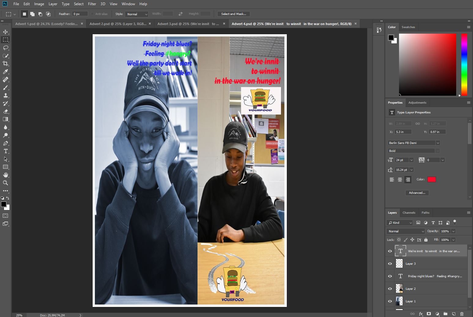
For the before shot, as seen in the other adverts, I wanted to keep the black and white theme, but to give this photo and much deeper focus on the emotions on the models face. In the after shot, the colours are much more naturally vibrant, however what makes this shot stand out is the photoshopped brand logo, which is a burger box car, skidding into the shot. This makes it eye-catching, original, and is an establishing shot for the brand, as it specifically highlights the brand as the thing making this young man react this way. There is a heavy focus on the logo, and the impression the brand therefore gives off in this shot.
No comments:
Post a Comment