Wednesday, February 27, 2019
Mock up designs
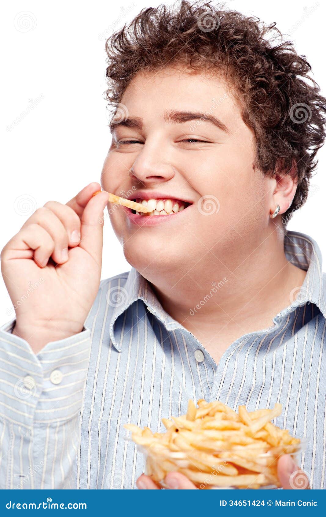
 For this advert, I want to make the left half look dark and dull, in order to show that it is a before shot. There is an importance of it being dark and looking dull, because I want people to relate to the feeling of being hungry and having no food. In the right half, we will see a person looking much happier, with the photo edited to look much brighter, in order to reflect the happy and satisfied feeling of finally having something to eat that you haven't had to cook. I want the before shot to have the text of 'Hank marving? Too busy to shop? Feeling #hangry? Food's on us!' I chose this because there are certain elements of the quote that have a link to Essex phrases, as well as the # which is a common theme among the youth group, as well as Essex people. This will be a running theme throughout all of the adverts, as a # is something to associate a brand with, and that is what I want for my food delivery advert. I will also have this text in a bold colouring, either a blue, or red colouring, with the #hangry being in a green colour, as this is an intertextual link to the hulk who turns green when he gets angry, and all people can relate to getting grouchy when they get hungry. On the right side, there will be the tagline of 'We're innit to winnit in the war on hunger!' The use of the phrase 'innit' is important, as it is another link to the commonly used Essex phrase. This gives it the personal touch of Essex culture. This will also be in a bold colour, either a red, gree, or blue. The logo will also be displayed on after delivery side of the advert to make people aware of the service that delivered the food.
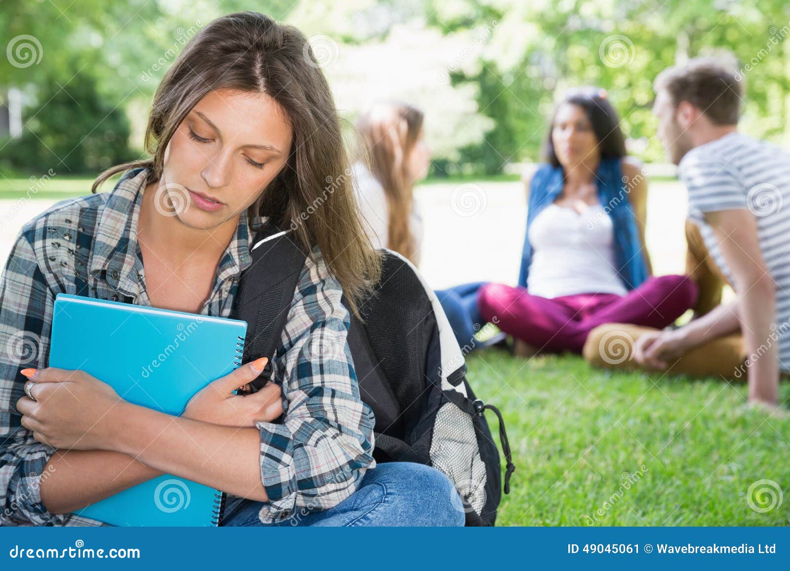
 For this advert, similar to the first advert, the first shot will be the before food delivery shot, showing people sat all separate, looking bored, lonely and hungry, with the photo edited to look dark and dull, all models will be acting very antisocial by being on their digital devices, which is a link to the youth group as a whole in how they are obsessed by technology. In the second shot after the food is delivered, we will see the models looking happy, content, and being social with the other people they are surrounded by, with the photo being edited to look bright and vibrant. The story in this advert is that people may be different in personality and appearance, however we all have one thing in common, and that is that we have to eat and that we all get hungry. Sometimes we need to put our phones down to see the wider picture which is what the narrative is in this advert. The text in this advert will say 'Lonely? Feeling #hangry? We've got it sorted!' This highlights that we all share food in common, and therefore eating food with another person can make you feel a little less lonely. The tagline will be displayed in the after food delivery shot alongside the logo.
 For this advert, there will be the before and after food delivery shots. In the first shot we will see a person holding a pan that is on fire, clearly trying to cook but are not good at it. This will link to the slogan 'Bad at cooking? Feeling #hangry? Can't stand the heat? Get out of the kitchen...food's on us!' This is therefore using humour and relatability to sell the brand to the audience. The image will again, be edited to look dark and dull. In the second shot, we will see a person delivering the food, looking happy and cheerful, with the photo edited to look vibrant. There will also be the tagline and the logo displayed on the right side of the advert, to highlight that the person delivering the food comes from this food delivery service.
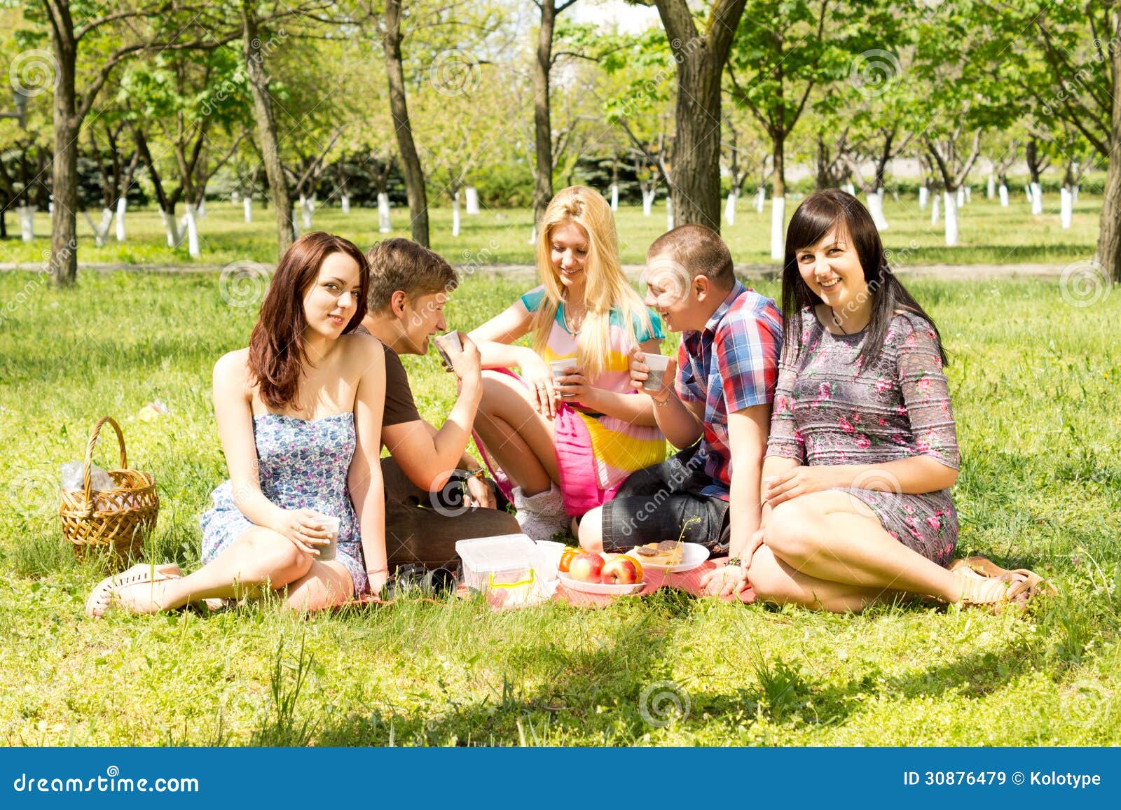
 With this advert, I am playing around with the location, as well as what I want the models to be doing. The theme of the advert will be being social. It will show people looking disappointed and bored. This is an evident side effect of being hungry. In the second shot, we will see people looking much happier after they have eaten their food. The slogan on the before shot will say 'Friday night blues? Feeling #hangry? Well the party don't start till we walk in!'. Again, with this advert, I will be highlighting the party atmosphere among most specifically the Essex youth group, as seen in The Only Way Is Essex. 'The party don't start till I walk in is also a link to the singer Ke$ha who the lyrics belong to, and whom is also popular among the youth group. This is therefore another intertextual link to a celebrity whom is popular with the youth. The tagline and logo will again be present on the after food delivery side of the advert.
Wednesday, February 13, 2019
Advertising research
Advertising research
Strategies for advertising products
- Endorsement
- Individual incentive - BOGOF
- Bold headings - catchy/memorable
- Alliteration - "Bob's Big Breakfast"
- Font - Serif and Sans Serif (modern)
- Celebrity endorsement - Gemma Collins
- Intertextual links - THE ONLY WAY IS ESSEX
- Bright and bold colours
- Student discounts
- Social media
- Hashtags
- Images
- Humour
- Exaggerated stereotypes
- Quotes or phrases - Vernacular (everyday language) e.g. "Peng", "reem", "innit", "y'know what i mean"
- Logo
- Saturated colours
Humour
Beauty
Youth
Endorsement
Popularity
Potential
Social
Pain solution
All elements I will use when making my advert:
Font :Berlin Sans FB Demi with a line going within the text, as i want to make it look modern and almost futuristic, and the targeted audience is 16-25 year olds. This is the font that will be used in the logo, and will be used for the slogan.

The sans serif font i will use for the coverline is Haettenschweiler font, as it is formal and will be in the blue colouring. I will use this font as it is formal but also futuristic, as well as the colouring being blue as it is almost disco colouring and party colouring.
One half dull colouring = before the food One half bright and vibrant =after the food
Slogan "We're innit to winnit in the war on hunger!"
Rhetoric questions
Want it to be set out life a before the food delivery vs after the food delivery

Use of hashtag = #hangry

------------------------------------------------------------------------------------------------------------------------
Concept 1:
University student with no food in his fridge and starving so orders food and is happy
Use rhetoric questions such as "Hank marving? Too busy to food shop? Feeling #hangry? Food's on us!"
Half 1: Half 2:
Dull colouring, boring, uninteresting Bright, bold, exciting and relateable to when you have food food

Concept 2:
Lonely student sitting on the grass while people are sitting chatting behind him. He wants to join in and they all have one thing in common...they are all hungry. He orders the food and becomes popular.
Use rhetoric questions such as "Lonely? Feeling #hangry? We've got it sorted!"
Half 1: Half 2:
Dull, sad and cold feeling warm, bright, vibrant and friendly, happy
Concept 3:
Group party with 18+ people. Party is very boring, people falling asleep, etc. The food gets delivered and it is very lively!
Use rhetoric questions such as "Friday night blues? Feeling #hangry? Well the party don't start till we walk in!"
Half 1: Half 2:
Dull, dark lighting, harsh almost Bright lighting, fun atmosphere, vibrancy, happy people


Concept 4:
Young people trying to cook, the pan is on fire and the kitchen is chaos. They opt for getting food delivered instead.
Use rhetoric question such as "Bad at cooking? Feeling #hangry? Can't stand the heat? Get out of the Kitchen....the food's on us!"
Half 1: Half 2:
Bright flames, almost like the Happy person getting their food delivered
flames of hell. Doom and gloom.


----------------------------------------------------------------------------------------------------------------
Location for Concept 1:
Kitchen/fridge
Location for Concept 2:
Local park
Location for Concept 3:
Living room
Location for Concept 4:
Kitchen and front door
Props for Concept 1:
Fridge
Pizza box
Burger box
Props for Concept 2:
Study books
Backpacks
Pizza boxes
Burger box
Props for Concept 3:
Beer bottles
Wine bottles
Pizza
Pizza boxes
Burger boxes
Burgers
Props for Concept 4:
Frying pan
Burger boxes
Pizza boxes
Wednesday, February 6, 2019
Textual analysis of print adverts
Textual analysis of print adverts

In this advert, I like how the advert uses vibrant colouring to make it interesting and intriguing to look at. I like how there is a contiuing them throughout all of the adverts, and this is an aspect that i will use in my advert, as the layout is interesting, and I want my advert to be as intriguing and interesting as this one. Especially because my food dellivery service will be targeted at the youth group, I want to use the bright colouring to intrigue them, and use the uniqueness of the advert as a selling point.

In this advert, i like the sophistication of the advert, and how it makes the food look appetising to the buyer. I won't be trying to sell the food like a gormet food delivery service, just as a quirky food delivery service that will appeal to the target age group.

I prefer the second logo in how the colours are more muted and natural. The green colouring would be good to associate with the healthy types of food, however I will be targeting the youth group, therefore have little interest in healthy food for a food delivery service. In my advert, i think i wil use the elelemnts of the defining ofd the elements in the lgoo so that it appears very bold and so that it is clear to the audience what they are looking at.

Logo design
My research on logos
 In this logo the use of bright and vibrant colouring is interesting to the audience to look at, as the variety of colours may be representative of the variety of things you can see in the different programmes that Sky broadcast on its channel. The bright, bold, saturated colours are analogous, meaning next to each other on the colour wheel. The colours look exotic and adventurous, and this draws the audience in. the use of the sans serif font is used in order to keep the brand sophisticated and formal. The glow on the writing looks almost like the glow you would see on a device screen, therefore the logo may be trying to channel the changing society within its logo.
Elements I will take from this logo are the bright colouring, such as the red and the blue, as they are vibrant colours, red often being associated with food, and blue being associated with nightlife, which is a huge part of Essex youth culture, therefore i want to add this association to my advert.
 In this logo, we see the use of the bright blue and white colouring. This brand is associated with children as they make films that are associated with childhood characters. The use of white is therefore significant in how children are associated with innocence, and white is a colour that symbolises innocence. The blue is symbolic of a calming and relaxing environment. For a child, these colours are associated with dreams and fantasy. The use of the serif font makes it look intriguing, interesting and fancy, and to a child this is interesting as it looks almost friendly and soft. This writing has sicne become a recognisable symbol that is universally known in how it is different from other fonts. The use of the castle symbol in the background has been done to again, attract a younger audience, as the castle is associated with a fairy tale, as well as an adventure story.
In this logo, I cannot see any elements I would like to replicate, as I would prefer to use a more sophisticated sans serif font, as it is common practice for logo text. I do however like how there is an object with the brand name, therefore this is an element I will incorporate into my logo, as if the brand name is not memorable on its own, the logo may be a recognisable symbol.
 In this logo for HMV (His Master's Voice) we can see a sans serif font used which looks almost like a neon sign light, which creates a link in a viewers mind to electricity, and then technology, which is what HMV is all about, selling technological devices, CD's, DVD's and many other things. The symbol of the dog listening to the gramophone is a direct link to the full name of the company, His Master's Voice, as at the time the shop was created, there was a coined phrase of which the company shares it's name, as well as a painting of dog listening to a gramophone. The decision to use this as the logo was a cultural and contextual link to the time the company was created. The colours used are not complimentary, nor analogous, however they are an interesting combination, as they are not dull, they are very bright and saturated. Again, the colours used create almost a glow of the neon signs that you may have seen in the 1980s, another contextual link to the upgrading of the symbol.
In this logo, i like the use of a bold, sans serif font, which is something I will incorporate into my logo, as i like the formality, as well as the simplicity of it, which makes it a recognisable logo. Therefore i will try to add these elements into my logo to make it a recognisable but simple as possible.
 With this logo, we can see a little boy fishing while sitting in the moon. Straight away, the two colours of white and blue are associated with sleeping and dreaming, and this is a direct link to the name of the company, Dream Works, as they want to play on specifically children's imaginations, and make them see things that are not normal, such as fishing on the moon which is seen in the logo. When the logo was created, Spielberg wanted it to reflect the golden years of Hollywood, so decided to use the moon as one aspect of the logo. The child is a contextual and social link to the creator, as it is the creator's son used within the logo. The font used is a serif font, which is often used in products that will be seen by children, as it is more fun, interesting, and less serious than a sans serif font.
In this logo, again, i like the use of the memorable logo with the recognisable brand name text, as seen in the previous two logos. again, the icon and the text is a strong element that i will draw inspiration form in designing my logo. I like the continuation of the logo being all one colour, however this is not an element I will use in my logo, as i want it to stand out and be bold, and to be bold in my advert, I would like to host a variety of different colours.
 The Odeon cinema logo is very basic in it's format, in how it is only text, yet there are many contextual links. The font used was chosen in order to replicated the Hollywood sign, which the company has a direct link to. The shaping of the font has also been used to make the text look like an old cinema ticket in how it had cut edges. The colours now used are mainly blue, which is a very calming colour, as well as being associated with dreaming, and being in a world that may not necessarily exist. The use of font and colouring is very basic, but an exact refection of what the company is and what it stands for.
With this logo, i love the simplicity of the logo, and how it has a contextual background to it in what the name is associated to, accordingly with my logo, i will attempt to give my brand name a link to the audience i am aiming my service at. Such as the use of a font similar to the blade runner font, as it is a futuristic film, and the youth is the future generation of the world, therefore there is an intertextual link to the future. I would also like to try and incorporate stereotypes of Essex youth within the logo, such as with the use of orange (orange skin), or blue (nightlife).
In this logo the use of bright and vibrant colouring is interesting to the audience to look at, as the variety of colours may be representative of the variety of things you can see in the different programmes that Sky broadcast on its channel. The bright, bold, saturated colours are analogous, meaning next to each other on the colour wheel. The colours look exotic and adventurous, and this draws the audience in. the use of the sans serif font is used in order to keep the brand sophisticated and formal. The glow on the writing looks almost like the glow you would see on a device screen, therefore the logo may be trying to channel the changing society within its logo.Elements I will take from this logo are the bright colouring, such as the red and the blue, as they are vibrant colours, red often being associated with food, and blue being associated with nightlife, which is a huge part of Essex youth culture, therefore i want to add this association to my advert.
In this logo, I cannot see any elements I would like to replicate, as I would prefer to use a more sophisticated sans serif font, as it is common practice for logo text. I do however like how there is an object with the brand name, therefore this is an element I will incorporate into my logo, as if the brand name is not memorable on its own, the logo may be a recognisable symbol.
In this logo, i like the use of a bold, sans serif font, which is something I will incorporate into my logo, as i like the formality, as well as the simplicity of it, which makes it a recognisable logo. Therefore i will try to add these elements into my logo to make it a recognisable but simple as possible.
With this logo, we can see a little boy fishing while sitting in the moon. Straight away, the two colours of white and blue are associated with sleeping and dreaming, and this is a direct link to the name of the company, Dream Works, as they want to play on specifically children's imaginations, and make them see things that are not normal, such as fishing on the moon which is seen in the logo. When the logo was created, Spielberg wanted it to reflect the golden years of Hollywood, so decided to use the moon as one aspect of the logo. The child is a contextual and social link to the creator, as it is the creator's son used within the logo. The font used is a serif font, which is often used in products that will be seen by children, as it is more fun, interesting, and less serious than a sans serif font.
In this logo, again, i like the use of the memorable logo with the recognisable brand name text, as seen in the previous two logos. again, the icon and the text is a strong element that i will draw inspiration form in designing my logo. I like the continuation of the logo being all one colour, however this is not an element I will use in my logo, as i want it to stand out and be bold, and to be bold in my advert, I would like to host a variety of different colours.
With this logo, i love the simplicity of the logo, and how it has a contextual background to it in what the name is associated to, accordingly with my logo, i will attempt to give my brand name a link to the audience i am aiming my service at. Such as the use of a font similar to the blade runner font, as it is a futuristic film, and the youth is the future generation of the world, therefore there is an intertextual link to the future. I would also like to try and incorporate stereotypes of Essex youth within the logo, such as with the use of orange (orange skin), or blue (nightlife).
Task 1 -Demo

The fonts used are as follows:
1. Berlin Sans FB Demi
2. Lithos Pro
3. Myriad Pro
4. Impact
Task 1 - Logo design

From the demo that i done previously, i picked out the bits that i liked most out of all of the practices i done, and put all of those elements into these designs.
The fonts used are as follows:
1. Haettenschweiler
2. Berlin Sans FB Demi
3. Eras Bold ITC
With the top font I wanted the text to be big, bold and stand out. This is why I changed the width of the font, made the writing bold, and gave an outline to the text. I wanted there to be a running theme of being bold and standing out. I done this as almost a metaphor for the youth group being a bold generation, set out on a quest to stand out from other previous generations. I used the blue colouring as I wanted there to still be the association to nightlife and partying, and blue is a colour commonly seen in nightclubs as it gives almost a neon glow.
With the middle font, I wanted to keep the elememets from my font test of the line going throught the test, as I wanted to keep the inspiration from the blade runner font, as again, it is is futuristic and exciting. I also wanted to experiment with the inside of the font by adding a pattern into the middle of it, in order to make the logo more unique and interesting. I kept the same colourings of black and blue as I wanted to keep the nightlight association.
With the final font, again, I wanted to experiment with my use of patterns and see what would stand out the most. With this font, I decided to get rid of the outline of the font and see how to make it stand out without having to keep a bold outline, as well as being adventurious with the colourings.
After my testing of all the fonts, colourings and patterns, I have decided I will stick to the deisgn I created in the middle example, as I conducted a small survey on five people in the specified age group, all of which said they preferred the middle font.
Logo design 1
 For my first design, I wanted to incorporate the Essex stereotype of the obsession over appearance and looking good, therefore decided to have the characters in a flashy, expensive car. I also decided I wanted a fair representation of all people, so have men women, and people from all groups in society. One of the characters was made to look like the stereotypical Essex girl with the blonde hair, fake tan, heavy makeup, big hair, fake lashes, big boobs, as well as glam. This was made to have a intertextual link to The Only Way Is Essex, and specifically, Gemma Collins, a prominent Essex woman. The next character is a spotty, technology obsessed burger, representing the teenage group stereotype, as well as a sporty pizza. The font has been placed on the side of the car as it makes the whole design come together as one, and makes it look almost cosy. The use of cartoons and over emphasising stereotypes has been done as a humour element to grab the audiences attention, as humour is a technique to gain attention. The fact that it is food shows that it Is a food service, as well as it driving a car, combined to create the idea of food driving to you. therefore there is a narrative behind the logo, which is the food being delivered to you.
 When creating the logo on photoshop, every layer was a single item on the logo, such as one tyre, then the other tyre. I done this as I wanted to make sure each specific element was perfect, and the other elements I wanted to improve on from the drawing, were covered over and drawn on after all layers were filled and outlined. I decided to make the colouring as bold and bright as possible, such as the pink car, as this is a colour typically associated with Essex girls wearing, which is why the Gemma Collins chip is also wearing pink. I wanted to create a party atmosphere, which is why the font used is futuristic and like something you would see plastered in a bar or nightclub.
Logo design 2
 For my second design, I immediately knew I wanted the intertextual link to The Only Way Is Essex, and so I decided to use this as the number plate. Again, I played on the stereotype of Essex people being obsessed with appearance and cars, therefore a car burger box feeds the stereotype, as well as bringing an element of humour into the product. The idea of a burger driving brings further humour to the logo, as it seems so silly, but it makes you laugh. There is also the intertextual link to Essex youths driving dangerously, so puts a comedic spin on a negative stereotype of Essex youths being involved in crime. Again, we see the logo close together in format, in how the text is under the wheels, almost like it is driving over it. Again, we see the same narrative as in the first logo, with the burger driving itself to you, highlighting that it is a food delivery service.
The same as with the first logo, I decided to make each individual bit of the drawing a layer which I masked by colouring the inside and creating stroke outlines of different depths to emphasise certain bits of the drawing. With the number plate, I wanted to keep the pink intertextual link to girls from Essex in how they are associated with being obsessed with the colour pink.

The final logo came out exactly how I wanted it to. From the 5 people in the age group the product I targeted at, all 5 said they love the creativity of the logo, with all of them pointing out the TOWIE number plate as a point which drew their attention, as well as the vibrant use of colours. I wanted to include elements of both the males and females of the target market, and used elements form these groups in the form of a speeding car, for the boy racers, as well as reckless drivers, and the pink personalised and branded number plate for the ladies, as it is a personal touch of glamour, as well as being an intertextual link to TOWIE.
Friday, February 1, 2019
Requirements of the brief
Requirements of the brief
•You work
for an in-house print production company within an advertising agency. You have
been given the task of producing a campaign of four full-page magazine adverts to
promote a new takeaway food delivery service.
•Summary
of brief requirements:
–Statement
of Intent (approx.
350 words).
350 words).
–Magazine
adverts:
The
client has insisted that each advert must have a different main image, with at least
two different
settings and at least two different models used across the four adverts.
–Location
of adverts: The
adverts are to be placed in regional magazines and
the content should reflect the location.
–Client
target audience: 16–25,
mass market, male and female demographic in a defined geographical region.
•This new
takeaway food delivery service – YourFood
–
wants to be defined by its regional and youthful brand identity.
•All
four adverts must contribute to a strong and consistent brand identity, using
the same slogan/tagline.
•The
adverts should use techniques – such as intertextuality,
generic hybridity, humour or
emotional appeal – that engage the target audience and make the adverts
memorable.
•Your
finished realisations of
the four adverts must be presented as A4 prints, with
the image scaled down as necessary to preserve the correct magazine page ratio.
the image scaled down as necessary to preserve the correct magazine page ratio.
•Your
magazine adverts must adhere to the rules of the Advertising Standards
Authority (ASA): https://www.asa.org.uk/
Product Details
•The production
must include (as a minimum):
•At
least four
different
main images. All images must be original across the four adverts to fit the
brand identity and the conventions of magazine adverts.
•Editing
of adverts (including photos, text, graphics, typography and layout) to fit the
brand identity and the conventions of magazine adverts.
•At
least two
different
settings (this may be the same location with a significantly different use of mise-en-scène
and/or lighting or two different locations).
•At
least two
characters
representing at least two different social groups across the four
adverts.
•Written
text including product name and a slogan/tagline that expresses the brand
identity.
•Appropriate
consideration of where the adverts will be displayed.
•Adherence
to the rules of the ASA.


Mind map of stereotypes associated with Essex / Essex Culture
 Chavs Cheap Footballers wives Benefit cheats
 Social disorder High crime

Subscribe to:
Comments (Atom)